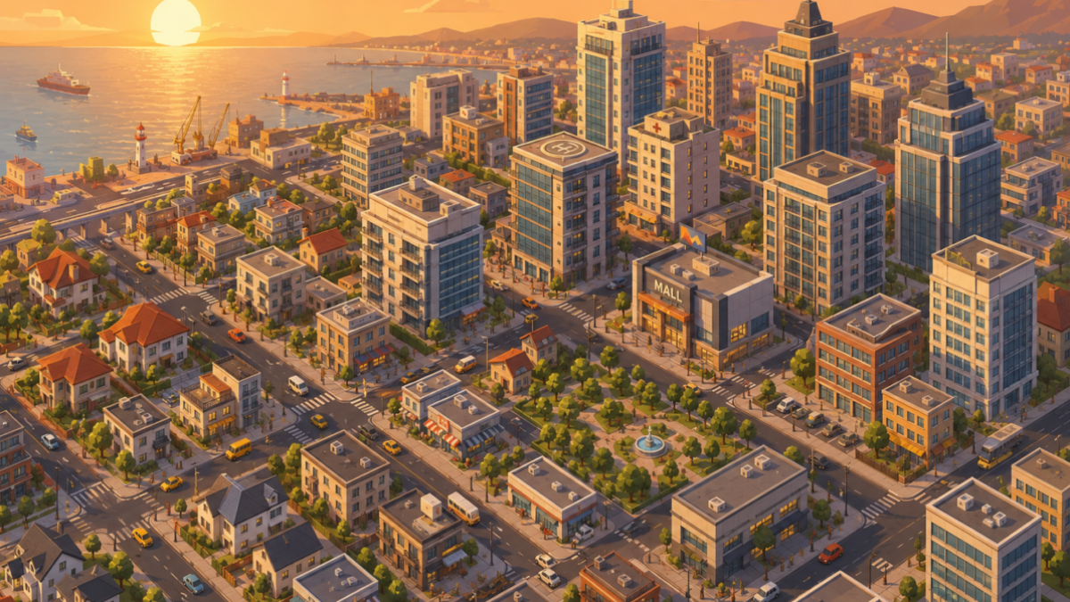
Drop three isometric building assets into the same scene, and it usually goes one of two ways. Either they lock together like they were always meant to sit side by side — or something feels subtly wrong, and you can’t quite say why. Nothing is technically broken. The buildings just don’t belong together.
That gap between professional isometric design and a pile of nice-looking assets isn’t about drawing skill. It’s a handful of rules that most isometric art quietly follows, and that most tutorials never bother to name. Once you know what they are, building a convincing scene — or judging whether a new asset pack will actually work with what you already have — stops being guesswork.
It really comes down to one decision: isometric design isn’t primarily a style choice, it’s a readability trade-off. Everything else — how the assets behave, how a scene gets assembled, why some combinations quietly fail — follows from that one decision.
The Trade-Off That Makes Isometric Design Work
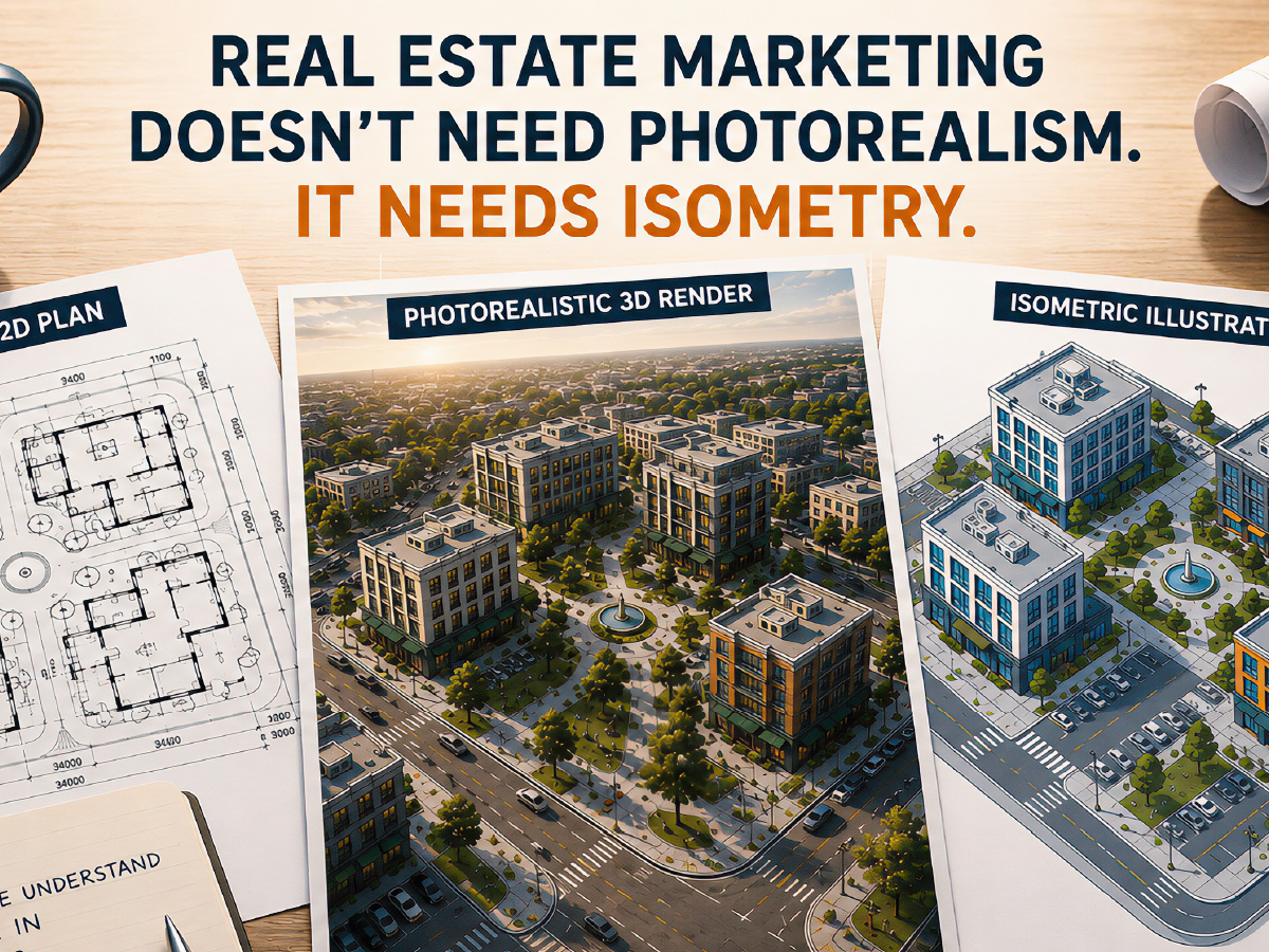
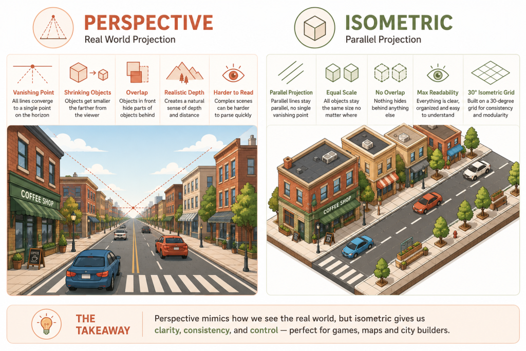
Real cameras and human eyes shrink things as they get farther away, and let them overlap and blur into each other. That’s what makes a photograph feel three-dimensional — and it’s exactly what makes a busy game screen hard to parse at a glance. Isometric art trades that realism away on purpose. Draw everything along two fixed axes, tilt it 30 degrees, remove the vanishing point entirely, and a building at the far edge of the map ends up exactly the same size as one in the center of the screen. Nothing shrinks, nothing hides behind something else. It reads more like a well-lit diorama than a photograph, and that’s the point: a diorama is built to be understood at a glance, not admired for depth.
That’s precisely the problem city-builders needed solved, long before real-time 3D cameras were fast enough to render smoothly. A flat top-down map can show you where a building is, but not how tall it is — and isometric perspective answered that almost as a side effect. A three-story townhouse visibly reads as taller than the workshop next to it, with no rotating camera and no geometry hiding behind a wall you can’t see through. That’s also why the trade-off maps so cleanly onto a grid: it’s the same logic most city-builders already use under the hood to track roads, zoning, and buildable tiles. The art and the code end up speaking the same language, which is a big part of why the look has outlasted every “more realistic” alternative the genre has tried.
What Actually Makes Assets Reusable
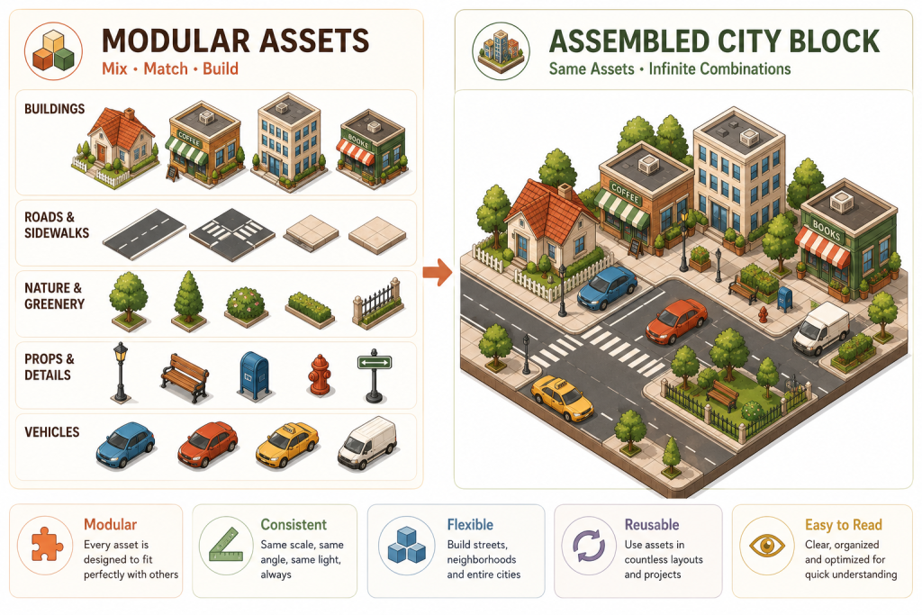
Here’s the practical payoff of that trade-off: once every object shares the same angle and the same light source, an isometric asset behaves a lot like a LEGO brick. Snap it into a scene, rotate it, recolor it, reuse it a dozen scenes later, and it clicks into place without a redraw. A road tile designed years ago will still line up with a building designed yesterday — as long as nobody quietly broke the angle or the light direction somewhere in between.
That “as long as” is doing a lot of work, and it’s the part most people learn the hard way. Two isometric asset packs from two different artists can both look great individually and still refuse to sit in the same scene, because one of them was drawn a few degrees off, or lit from a slightly different direction. It’s rarely a quality problem. It’s a compatibility problem, and it’s worth checking for before you buy or download anything you plan to mix with what you already have — not after.
Building a Scene That Feels Alive
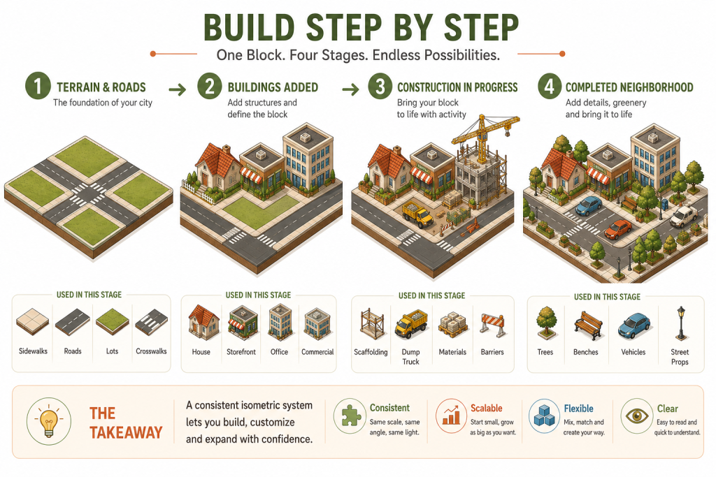
Consistency gets your assets to fit together. It doesn’t automatically make a scene feel real — that’s a separate, sequencing problem. The scenes that read as believable are built in a specific order: terrain and roads first, finished buildings next, and only at the end the small details — parked cars, benches, a stray tree — that keep the result from feeling like a showroom nobody’s moved into yet.
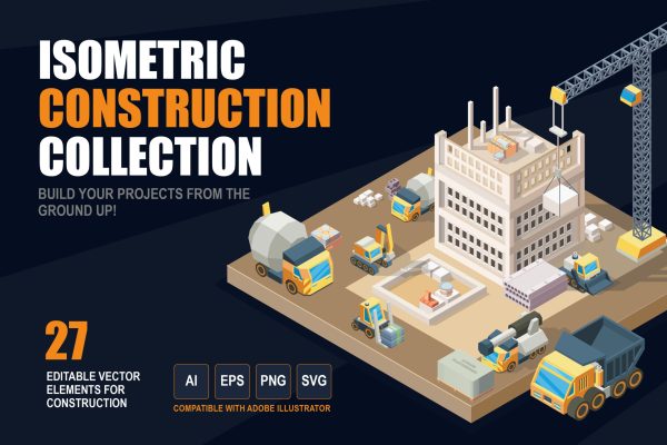
There’s one layer in that sequence I see skipped constantly: the construction zone. A half-built house. A dump truck parked next to a stack of bricks. It’s a small addition, and it does an outsized amount of work — a city with nothing under construction anywhere doesn’t read as a living place, it reads as a diorama someone finished and walked away from. Adding even one unfinished block is usually enough to flip that impression.
Where Scenes Quietly Fall Apart
Most broken isometric scenes trace back to the same three culprits, and all three are easy to check for once you know to look. A mismatched light source is the most common: mix assets whose shadows fall in different directions, and the whole scene starts to look faintly assembled rather than designed, even when every individual piece is well made. Inconsistent tile scale is a close second — combine assets built for a 2:1 grid with ones drawn to a slightly different ratio, and you get gaps or overlaps that no amount of careful placement fully hides.
The third is subtler: mixing flat vector isometric with rendered pseudo-3D pieces in the same scene. It tends to feel like a film where half the cast is animated and half is live-action — most people can’t say exactly what’s wrong, but they notice something is. The fix for all three is the same, and it isn’t clever: pick one projection and one light direction for a project, and hold every asset to it, whether it’s purchased, free, or hand-drawn. It’s not a technique so much as a habit, and it’s the single biggest difference between a scene that reads as one coherent world and a scene that reads as a stack of nice pieces.
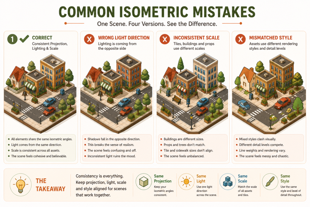
The Takeaway
Every question this article started with — why some isometric scenes click and others don’t, why certain assets refuse to mix — traces back to the same trade-off: isometric design gives up realism for consistency, and that consistency is a discipline you maintain, not a talent some artists have and others don’t. Protect the angle, protect the light source, and the rest tends to take care of itself.
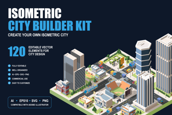
If you’d rather start from a set that already keeps that discipline for you, the Isometric City Builder Kit and the Isometric Construction Asset Collection are both built to one shared angle and light source, including the roads-and-buildings side of a scene and the under-construction layer this article kept coming back to. The Free Isometric Construction Assets pack is a lower-commitment way to check whether the style fits your project before picking up either.