Articles & Guides
Tips, tutorials and behind-the-scenes notes on branding, illustration and running a design-asset business.
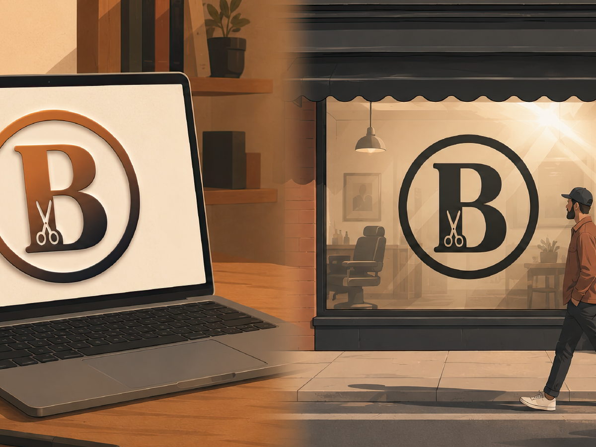
The Barbershop Logo That Looked Great on a Laptop
A barbershop's logo looked perfect on a laptop and turned to mush once it was cut from vinyl and stuck on the window. Here's how to design a logo that holds up at every size and on every material.


Your Creator Brand Needs a System, Not a Single Logo
One logo can't survive a YouTube thumbnail, an Instagram post, and a podcast cover — they're three genuinely different shapes. Here's how to build a small, adaptable visual system instead.
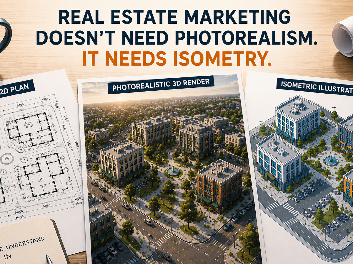
Real Estate Marketing Doesn’t Need Photorealism. It Needs Isometric.
Most real estate teams don't know there's a third option between a plan nobody can read and a render that costs a fortune. Here's why isometric illustration is built to win the readability question — no vanishing points, no distorted proportions, just a layout anyone can understand in seconds. It's the format serious teams reach for on site plans, master-plan overviews, and investor decks. It's the wrong tool the moment you're selling one specific unit's finish and mood — that's still a job for photorealism. Here's where each one actually earns its place.
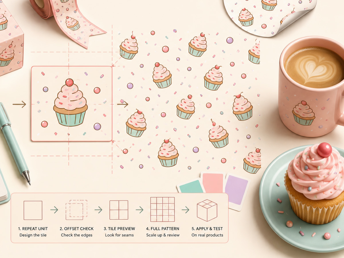
How a Single Cupcake Illustration Becomes an Endless Seamless Pattern
Two designers can start with the exact same cupcake illustration — same colors, same linework, same charm — and end up with completely different results the moment they try to turn it into a seamless pattern for packaging. One version tiles cleanly across a box, a ribbon, a sheet of stickers, disappearing into one continuous, […]
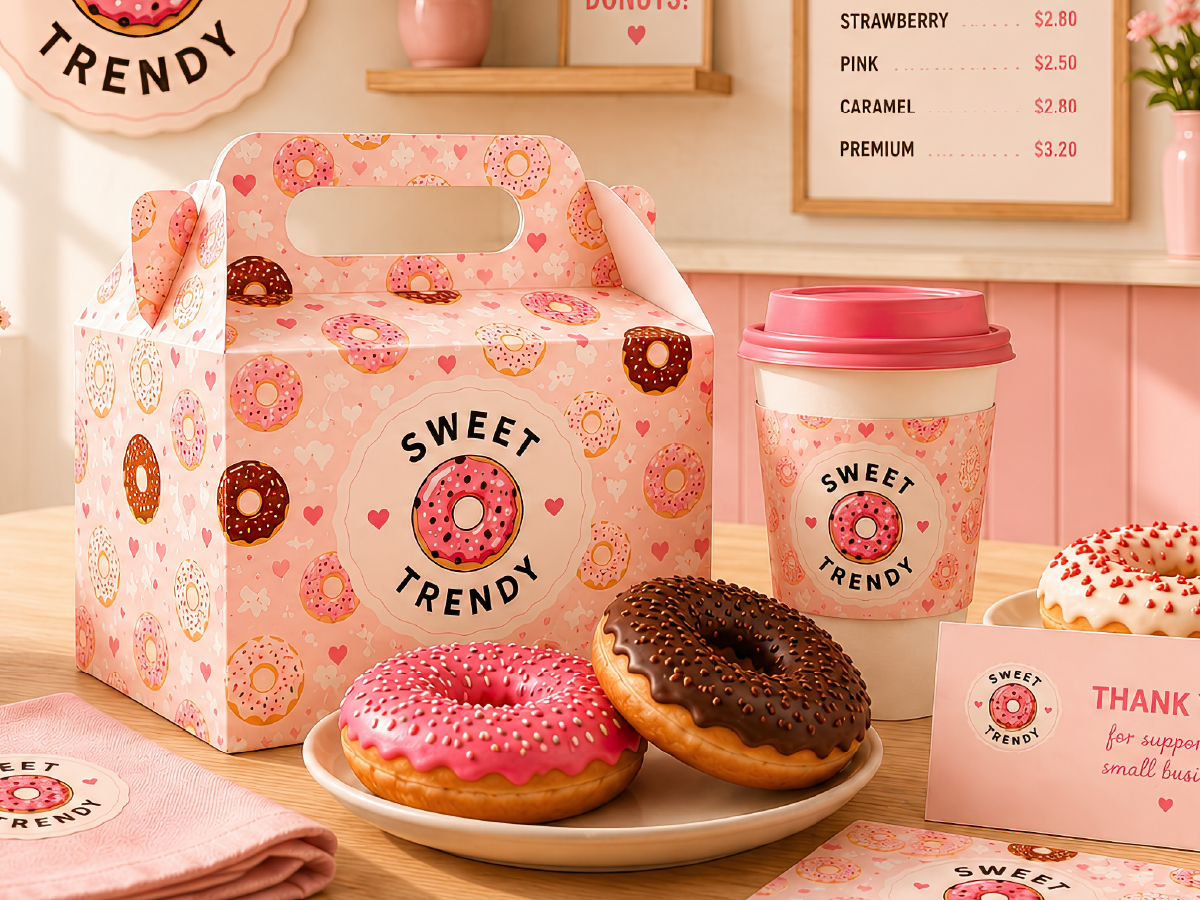
The Donut Branding Mistakes That Make Every Bakery Look the Same
Scroll through the Instagram feed of twenty different bakeries and dessert shops, and something odd happens: after the first ten, they start blurring together. Different names, different cities, sometimes wildly different price points — and yet the donut branding — illustrations, packaging, the little pattern in the background of every third post — all feels […]

How Isometric Design Powers City-Builder and Strategy Games
Drop three isometric building assets into the same scene, and it usually goes one of two ways. Either they lock together like they were always meant to sit side by side — or something feels subtly wrong, and you can’t quite say why. Nothing is technically broken. The buildings just don’t belong together. That gap […]
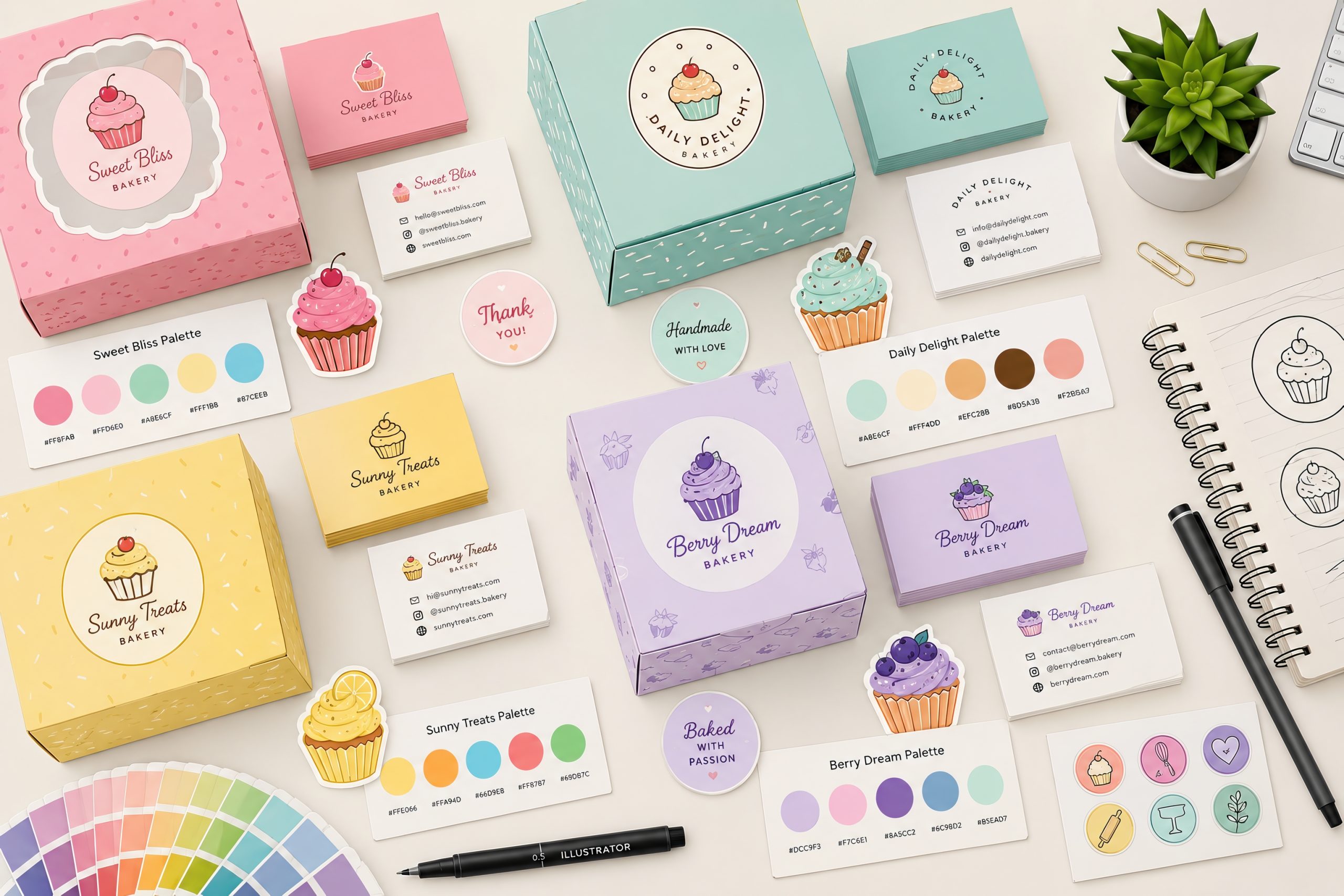
Bakery Color Palette Ideas for Modern Bakery Branding
Choosing the right bakery color palette is one of the most important steps in creating a memorable dessert brand. Whether you’re designing a cupcake shop, pastry boutique, bakery café or home baking business, your colors communicate quality, flavor and personality before customers even taste your products. Successful bakery branding combines colors, typography, illustrations and packaging […]
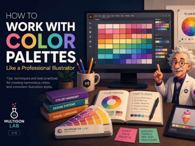
How to Work with Color Palettes Like a Professional Illustrator
Why Color Palettes Matter Every successful illustration starts with thoughtful color choices. While many beginners focus on shapes and details, experienced designers know that a carefully built color palette often determines whether an illustration feels professional or amateur. Working with predefined palettes helps maintain visual consistency, speeds up production, and makes entire collections feel cohesive. […]
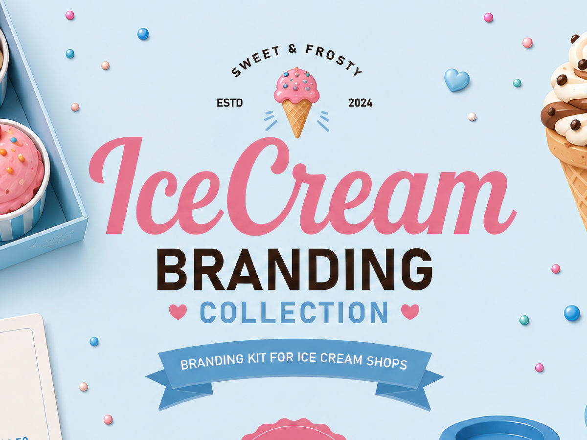
How to Create Ice Cream Branding That Stands Out in 2026
Learn how to create memorable ice cream branding using illustrations, patterns, packaging design and marketing assets. Ice cream is one of the most visually driven food categories… 1. Start with a Consistent Visual Style A successful ice cream brand is more than a logo… Examples of illustration styles used in modern ice cream branding. 2. […]