Why Color Palettes Matter
Every successful illustration starts with thoughtful color choices. While many beginners focus on shapes and details, experienced designers know that a carefully built color palette often determines whether an illustration feels professional or amateur.
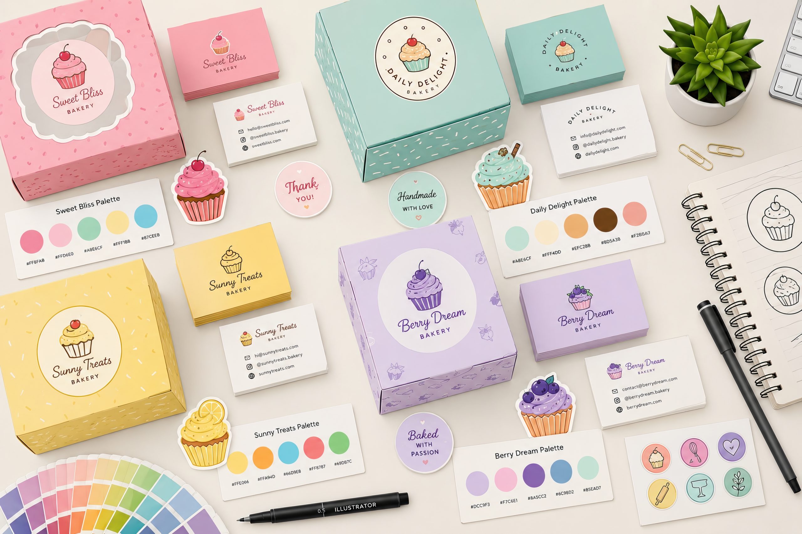
Working with predefined palettes helps maintain visual consistency, speeds up production, and makes entire collections feel cohesive. This is especially important for branding projects, icon packs, stickers, and vector illustration sets.
Start with a Limited Number of Colors
One of the biggest mistakes is using too many colors. Professional illustrators often begin with only five or six base colors. These colors become the foundation of the entire project.
A simple palette can include:
- one primary color
- one secondary color
- one accent color
- one dark neutral
- one light neutral
From these few colors you can generate dozens of variations while maintaining harmony. Using fewer colors also makes illustrations easier to recognize and strengthens your personal visual style.
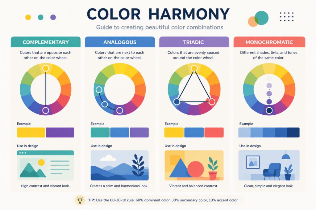
Build Color Harmony
Instead of selecting colors randomly, use established harmony principles.
Popular combinations include:
- Complementary
- Analogous
- Triadic
- Split Complementary
- Monochromatic
These systems create balance and reduce visual conflicts between elements. Even if you later adjust saturation or brightness, starting from a harmonious structure gives much better results.
Create Shades Instead of Random Colors
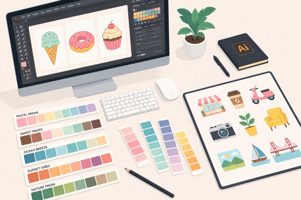
A professional palette rarely contains dozens of unrelated colors. Instead, create lighter and darker versions of every base color.
For example:
- 100%
- 80%
- 60%
- 40%
- 20%
This approach provides flexibility while preserving consistency. Shades also improve depth, shadows, highlights, and interface elements without introducing unnecessary new colors.
Keep Palette Consistent Across Projects
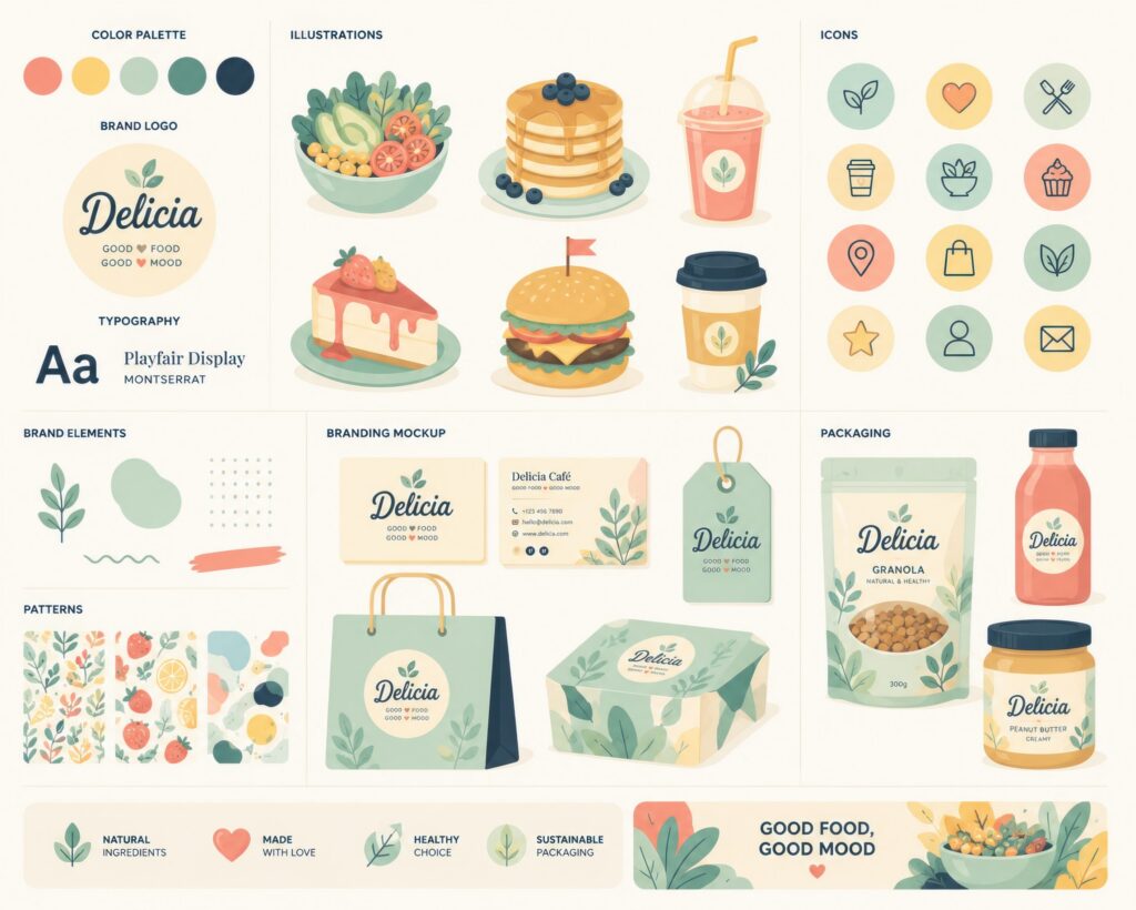
If you’re building a product line or brand, reuse your palettes whenever possible.
Many successful illustration libraries are instantly recognizable because they consistently use the same family of colors.
This consistency helps:
- build brand identity
- simplify future projects
- improve portfolio cohesion
- strengthen customer recognition
Rather than reinventing your palette every time, expand existing systems gradually
Save Your Palettes Properly
Creating great palettes is only half the process. Professional designers save reusable swatches inside their design software so every future project begins with the same reliable colors.
Whether you’re working in Illustrator or another vector editor, maintaining organized color libraries saves hours of repetitive work. Creating reusable palette files also makes collaboration much easier.
Common Color Mistakes
Avoid these frequent problems:
- Using too many saturated colors.
- Mixing unrelated color temperatures.
- Creating every illustration with a different palette.
- Ignoring contrast.
- Choosing colors directly from reference images without adjustment.
- Forgetting accessibility and readability.
A strong palette isn’t about having more colors—it’s about using fewer colors more intentionally.
Final Thoughts
Mastering color palettes is one of the fastest ways to improve the quality of your illustrations. By limiting your base colors, building structured harmony, creating reusable shades, and maintaining consistency across projects, you’ll produce artwork that looks cleaner, more professional, and instantly recognizable.
Great illustrations rarely happen because of luck—they are built on thoughtful systems, and color is one of the most important.
If you’d like to see these principles already built into a working system, our branding kits — the Donut Branding Kit, Ice Cream Branding Collection and Cupcake Branding Kit — each ship with a limited, harmony-based palette applied consistently across dozens of illustrations, ready to study or drop straight into your own projects.