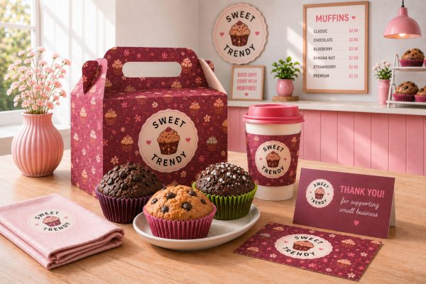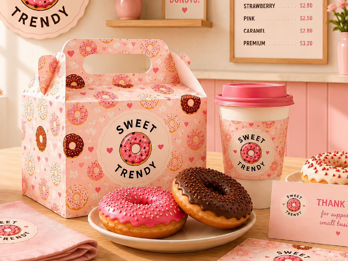
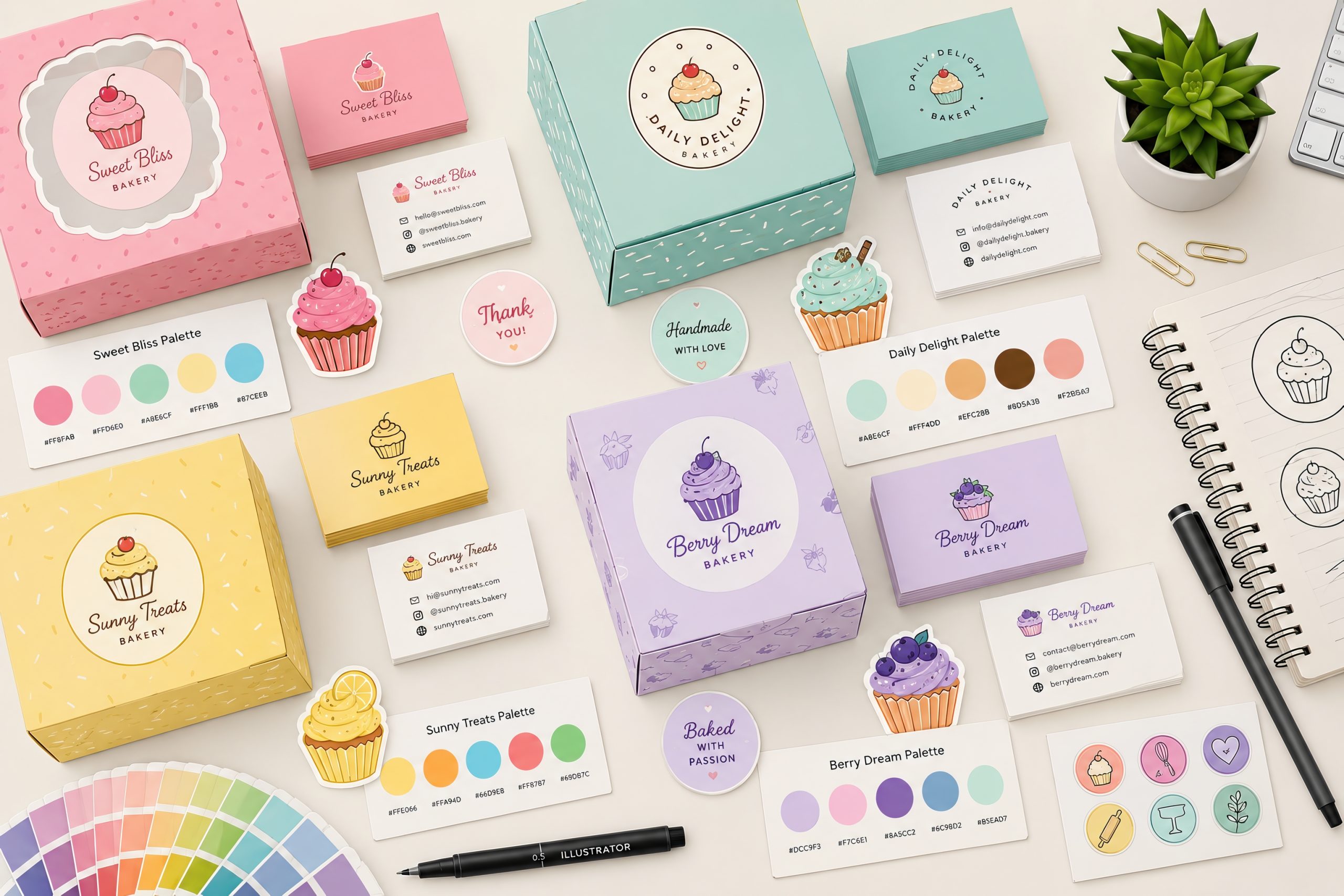
Choosing the right bakery color palette is one of the most important steps in creating a memorable dessert brand. Whether you’re designing a cupcake shop, pastry boutique, bakery café or home baking business, your colors communicate quality, flavor and personality before customers even taste your products.
Successful bakery branding combines colors, typography, illustrations and packaging into one consistent visual identity. Warm pastel tones create a welcoming atmosphere, while richer colors can emphasize premium products or seasonal collections.
Why Color Matters in Bakery Branding
Colors influence how customers perceive freshness, sweetness and quality.
Soft colors often suggest:
- homemade products
- fresh ingredients
- friendly service
- handcrafted desserts
More saturated palettes help communicate:
- premium quality
- luxury desserts
- gourmet pastries
- modern bakery brands
Choosing a consistent bakery color scheme also improves recognition across social media, packaging, websites and printed materials.
Popular Bakery Color Palettes
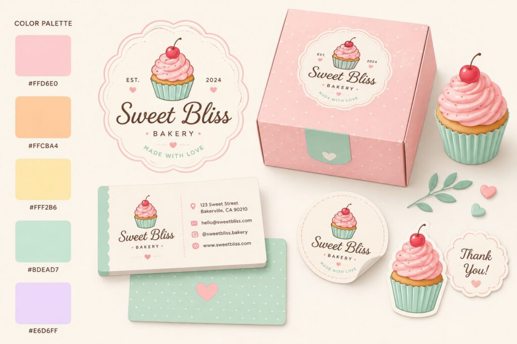
Soft Pastel Palette
Perfect for:
- cupcake shops
- baby shower desserts
- wedding bakeries
Typical colors:
- Soft Pink
- Cream
- Light Mint
- Powder Blue
- Warm Beige
This palette feels friendly, elegant and approachable.
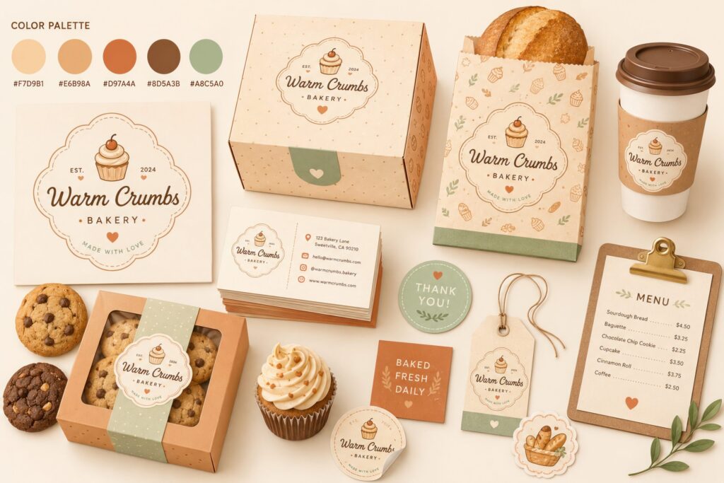
Warm Bakery Palette
Inspired by:
- fresh bread
- cookies
- cinnamon
- caramel
- chocolate
Typical colors:
- Cream
- Golden Brown
- Chocolate
- Caramel
- Warm White
These colors create a cozy and authentic feeling that works especially well for artisan bakeries.
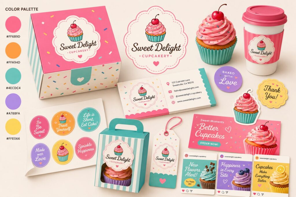
Bright Dessert Palette
Ideal for:
- cupcake brands
- candy shops
- birthday desserts
- children’s bakeries
Suggested colors:
- Pink
- Turquoise
- Lemon Yellow
- Coral
- Lavender
Bright colors immediately communicate fun and celebration.
How to Choose the Right Bakery Brand Colors
Before selecting your palette, consider:
Your target audience
Luxury pastry boutiques benefit from elegant neutral palettes, while family-oriented bakeries can successfully use brighter colors.
Your product range
Cupcakes, donuts and macarons naturally work well with softer pastel tones. Bread and artisan pastries often benefit from earthy colors.
Packaging
Always test how your chosen bakery brand colors appear on:
- boxes
- labels
- stickers
- paper bags
- social media graphics
Consistency across all materials strengthens your brand identity.
Keep Your Branding Consistent
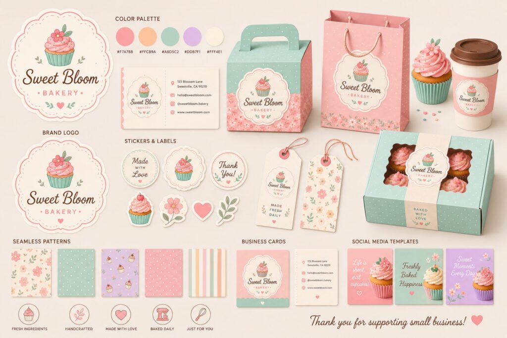
A successful bakery branding project includes more than colors alone. Your visual identity should also feature:
- logo
- illustration style
- seamless patterns
- icons
- typography
- packaging elements
- stickers
- social media graphics
Using matching design assets helps every customer instantly recognize your brand.
Common Bakery Color Palette Mistakes
Even experienced designers can make mistakes when selecting a bakery color palette. One of the most common issues is choosing too many colors. A palette with more than five or six primary colors often looks inconsistent and makes the brand harder to recognize.
Another frequent mistake is using colors that don’t match the type of bakery. Bright neon colors may work well for candy stores but usually feel out of place for artisan bakeries or premium pastry shops. Likewise, very dark color schemes can reduce the sense of freshness that customers expect from baked goods.
Finally, remember to test your bakery brand colors on different materials. Colors that look beautiful on a screen may appear very different when printed on boxes, labels or paper bags. A balanced palette should remain attractive across digital and printed branding materials.
Seasonal Bakery Color Palettes
Updating your bakery color scheme throughout the year is an excellent way to keep your branding fresh while maintaining a recognizable visual identity.
Spring collections often feature soft pink, mint green and light yellow shades that reflect freshness and new beginnings. Summer palettes introduce brighter coral, turquoise and citrus-inspired colors that create an energetic atmosphere.
During autumn, warm caramel, pumpkin orange, chocolate brown and cream become popular choices for bakery packaging. Winter branding usually combines elegant whites, deep reds, forest greens and subtle gold accents to create a festive appearance.
Seasonal accents can be added to packaging, social media graphics and promotional materials without changing your core bakery branding, helping customers recognize your business all year round.
Bringing Your Bakery Branding Together
A carefully selected bakery color palette becomes even more effective when combined with professional illustrations, packaging design and consistent visual elements. Logos, seamless patterns, stickers, business cards and social media graphics should all follow the same visual language.
Using coordinated assets not only saves design time but also helps build trust with customers. Consistency across every touchpoint makes your bakery appear more established and memorable, whether customers discover your brand online or visit your physical store.
If you’re creating a cupcake or dessert brand, starting with a complete branding kit can significantly simplify the design process while ensuring that every visual element works together as one cohesive identity.
Final Thoughts
The best bakery color palette reflects your products, your audience and your brand personality. Whether you prefer soft pastels, warm artisan tones or playful dessert colors, consistency is what makes a bakery memorable.
If you’re looking for ready-made design assets, our Cupcake Branding Kit includes coordinated illustrations, seamless patterns and branding elements that help create a professional bakery identity much faster.