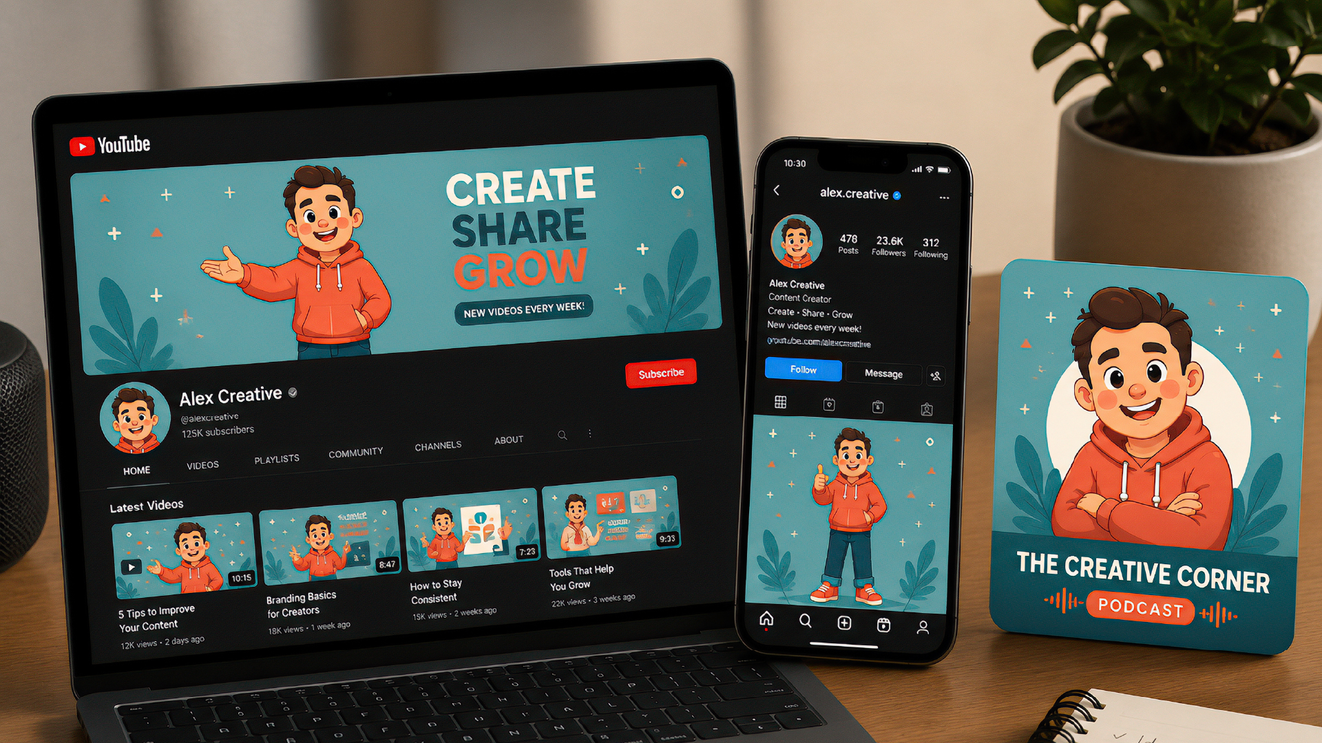
Someone spends a weekend building their creator brand identity around a mascot character for their YouTube channel — proportions right, colors dialed in, expression nailed. The thumbnail looks great. Then they post the same character to Instagram, and it ends up floating small and lost in the middle of a much taller frame, with far too much empty space around it. They try a podcast cover next — a perfect square — and the character, drawn standing at full height, gets its feet cropped clean off. By the third platform, they’re just eyeballing it and hoping nobody compares screenshots side by side.
Someone usually does compare them, though — not consciously, but the eye notices when three profiles claiming to be “the same creator” don’t actually look related. The mascot’s there in all three, technically. But the composition, the crop, the amount of empty space around it — none of it matches, so the brain reads it as three different people who happen to share a character design. That mismatch has a real cost: someone who found the channel on YouTube and goes looking for it on Instagram won’t recognize the account as the same one, and a genuinely warm lead just quietly drops off without ever following through.
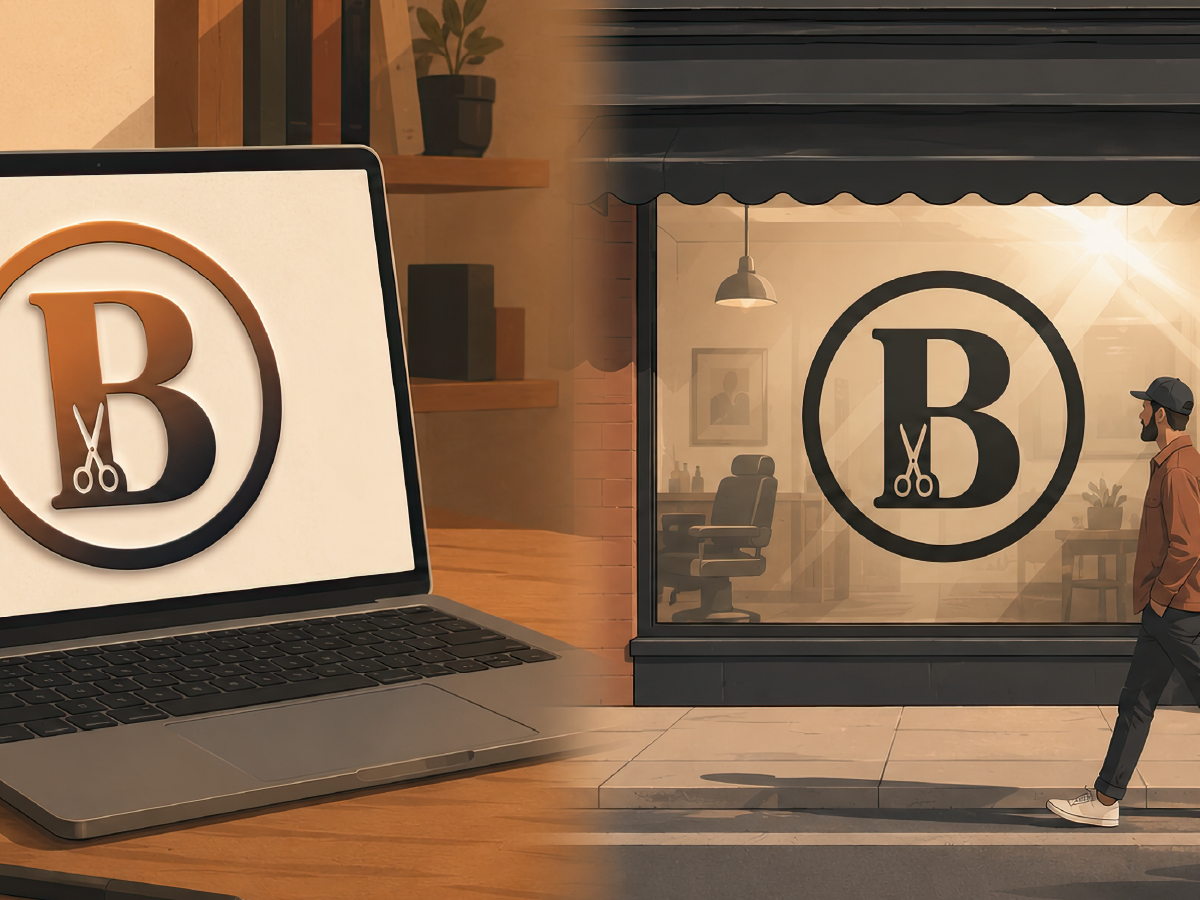
The instinct is to blame the logo. That’s not actually the problem. One single picture — however good it is — was never going to survive being squeezed into three completely different shapes unchanged. What actually works isn’t one fixed picture at all. It’s a small set of pieces built to bend on purpose, so each platform gets its own version instead of the same picture forced to do three jobs.
One Image Was Never Going to Survive Three Different Shapes
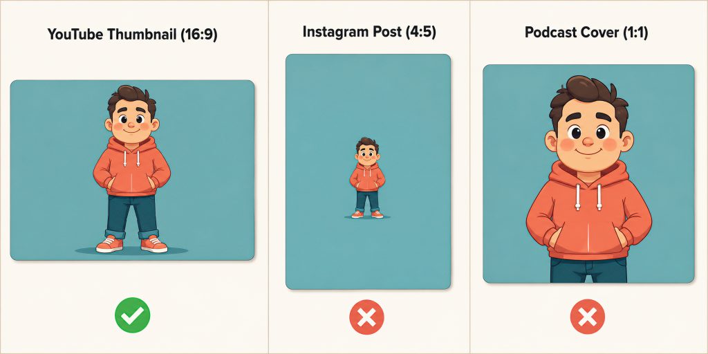
A YouTube thumbnail is landscape — 1280×720 at minimum, 16:9, wide and short. An Instagram feed post is portrait — 1080×1350, 4:5, tall and narrow. A podcast cover is a perfect square — Apple’s own standard is 3000×3000, 1:1. These aren’t three sizes of the same rectangle. They’re three genuinely different shapes, and a character that looks balanced in one will look off-center, cropped, or lost in the other two.
That’s why “just resize it” fails so consistently. Resizing keeps the proportions the same; it doesn’t fix the fact that the shape itself changed. A character drawn standing at full height for a wide thumbnail gets its feet cropped clean off the moment it’s forced into a square podcast cover — or ends up small and stranded in a sea of empty space once it’s dropped into Instagram’s much taller frame.
Build a Creator Brand Identity in Pieces, Not One Picture
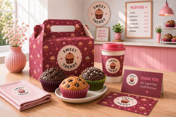
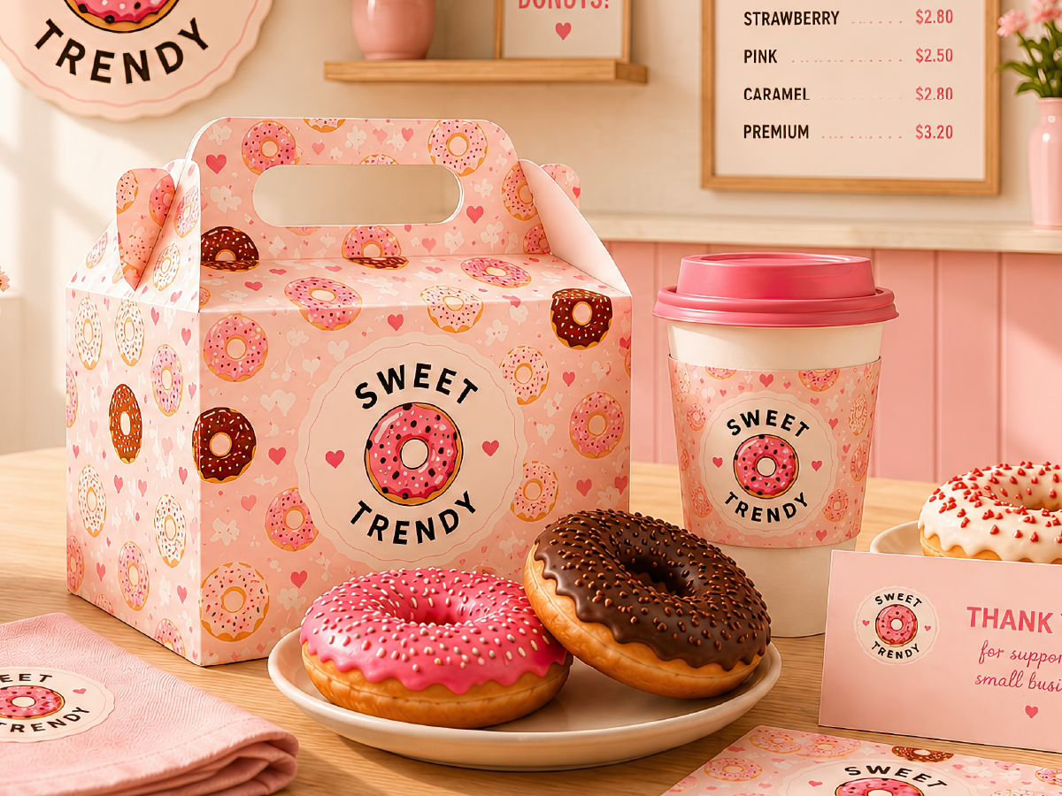
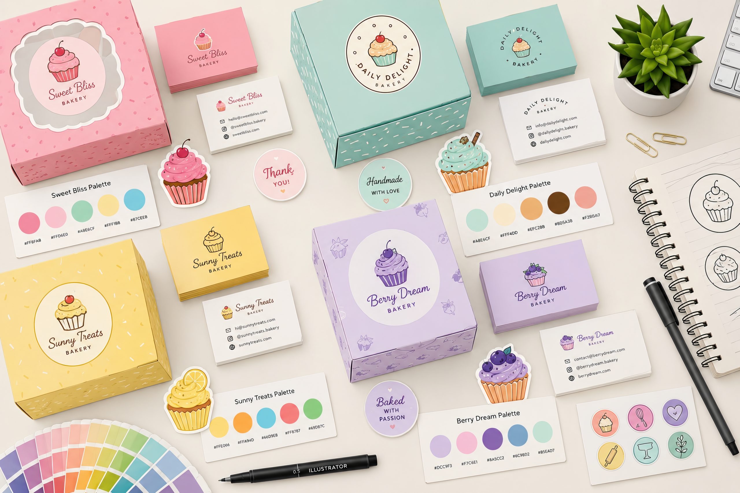
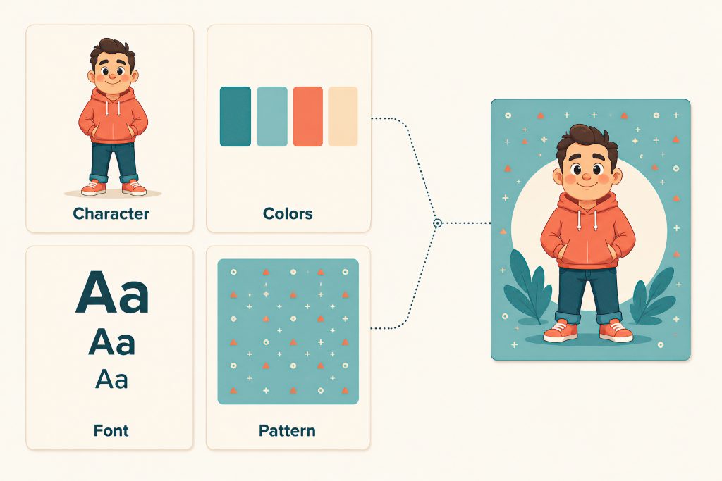
The real fix — the one professional brands actually use — is to stop thinking of your whole look as one finished picture. Think of it instead as a small set of swappable pieces: the character itself, a handful of colors you always use, one font you always use, and a background pattern that can shrink or stretch to fit any shape. Each platform gets its own picture, built from the same pieces — not the same picture squeezed to fit.
Think of it like a capsule wardrobe. A capsule wardrobe isn’t ten identical outfits — it’s a small set of pieces (one jacket, a few tops, one good pair of shoes) that get put together differently depending on the occasion, and the person still reads as consistently “them” in every combination. Your character works the same way: it doesn’t need to show up in the exact same pose and size everywhere — it just needs a few different poses that all clearly look like the same character, used differently depending on which shape you’re filling.
That same idea — one piece rearranged instead of redrawn for every new spot it needs to fill — is exactly what makes a single illustration work as an endless seamless pattern too, if you want to see how that works up close.
Building Your Own Adaptable Set
Start with the one piece that has to show up everywhere and stay recognizable — usually your character itself, not a whole scene built around it. Pick 3-4 colors and stick to them before you make a single picture for any specific platform, so you’re never guessing which color to use next time. Then pick one flexible pattern or background that can shrink into a small square or stretch into a wide banner without looking squished or stretched out — this is the piece most creators skip, and it’s the one that actually makes something look “on-brand” instead of just technically using the same colors.
Then try your character in all three real shapes — wide, tall, and square — before you finalize anything, not after. If you have to redraw the character from scratch for each shape just to make it look right, the character itself is too complicated and needs simplifying — not each individual picture.

Back to That Mismatched Profile
That creator from the start of this piece doesn’t need a better mascot. They need to stop asking one picture to do a job it was never built for, and start building a small set of pieces — the character, a few colors, one font, one pattern — that can actually bend into whatever shape the next platform throws at it. Once that’s built once, every new platform just means putting the same pieces together a little differently — not starting over from scratch.