Scroll through the Instagram feed of twenty different bakeries and dessert shops, and something odd happens: after the first ten, they start blurring together. Different names, different cities, sometimes wildly different price points — and yet the donut branding — illustrations, packaging, the little pattern in the background of every third post — all feels like it came from the same design folder. Most of these brands paid a real designer. Some paid for custom illustration work more than once. And it still didn’t stick.
That’s not a talent problem, and it’s not because donuts are an inherently hard thing to draw distinctively. It’s a systems problem hiding behind a taste problem. Brands keep reaching for a cuter illustration when the actual gap is consistency — the same palette, the same line style, the same pattern logic, showing up everywhere the brand appears, not just on the one graphic someone approved in a meeting. Fix that, and the “cute donut drawing” stops needing to do all the work by itself.
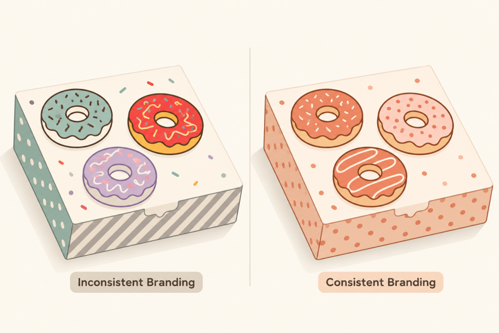
Why One Illustration Isn’t Donut Branding
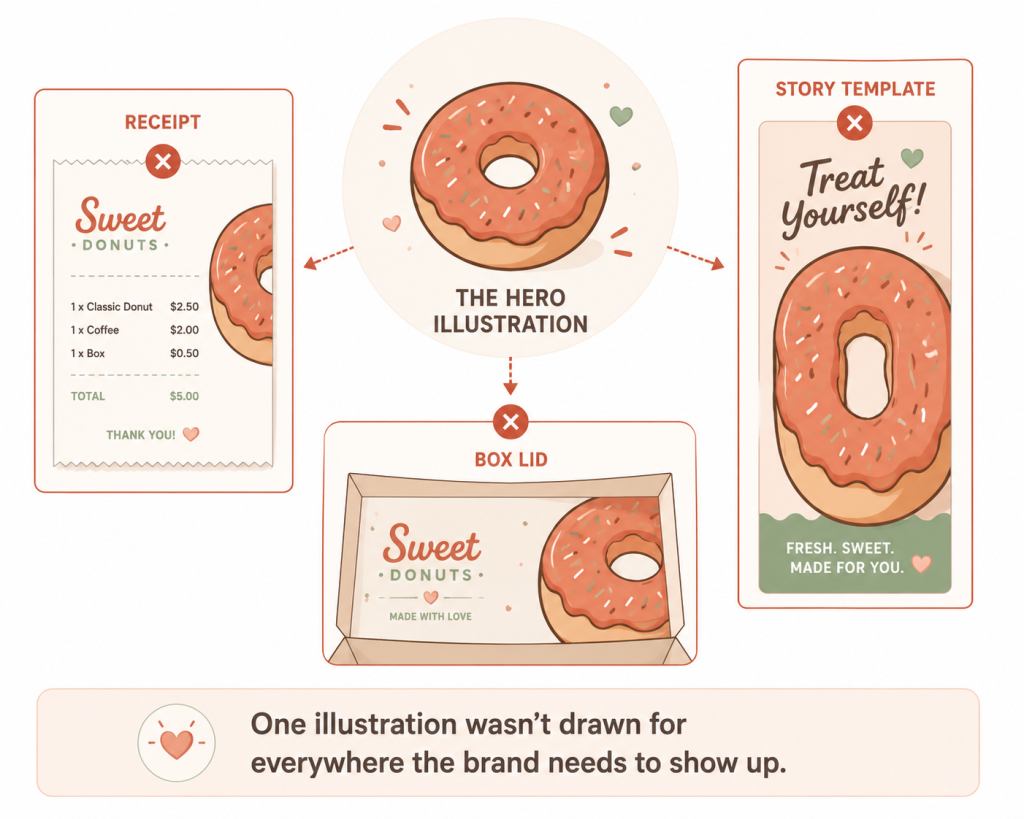
The most common starting point is also the quietest trap: a bakery commissions one great donut illustration — a hero graphic for the logo, the sign, maybe the top of the website — and treats that as the branding project, finished. It’s a reasonable place to start and a strange place to stop. One illustration, on its own, is a single plate on an empty table: pleasant to look at, but nobody mistakes one plate for a full place setting.
The gap shows up the moment the brand needs to appear somewhere that single illustration wasn’t drawn for — a receipt, an Instagram story template, the inside lid of a box. Someone reaches for a different donut clipart that “matches the vibe,” or crops the hero illustration awkwardly to fit, and the seed of inconsistency is planted on day one, usually before anyone notices there’s a problem to name.
Consistency Beats a Cuter Drawing
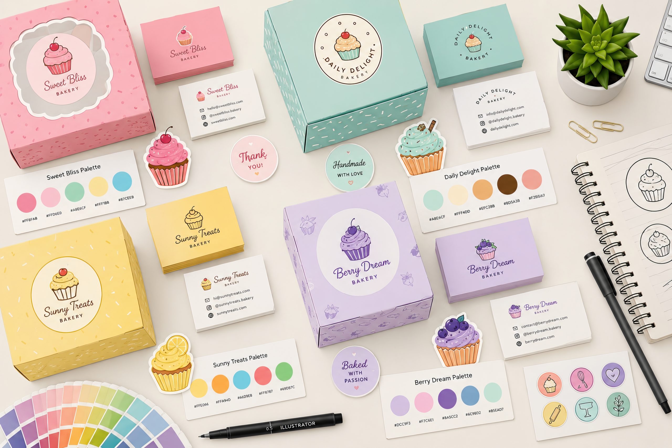
The second mistake compounds the first: sourcing illustrations from different places over time. A logo commissioned from one illustrator two years ago, a stock pattern grabbed for a packaging redesign last spring, a fresh set of social media graphics from a different freelancer this quarter. Every individual piece can be genuinely well made and the combined result can still read as improvised — like a storefront sign where the owner replaced one broken letter with a font from a different decade. Technically legible. Never quite coherent.
This is why chasing “a cuter illustration” rarely fixes generic branding on its own. A new hero graphic drawn beautifully, dropped into a system that already has three competing color palettes and two different line weights in circulation, just becomes a fourth voice in a crowded room. The fix was never really about any single asset’s quality — it’s about whether every asset in rotation was built to the same visual rules.
Building It as a System, Not a One-Off
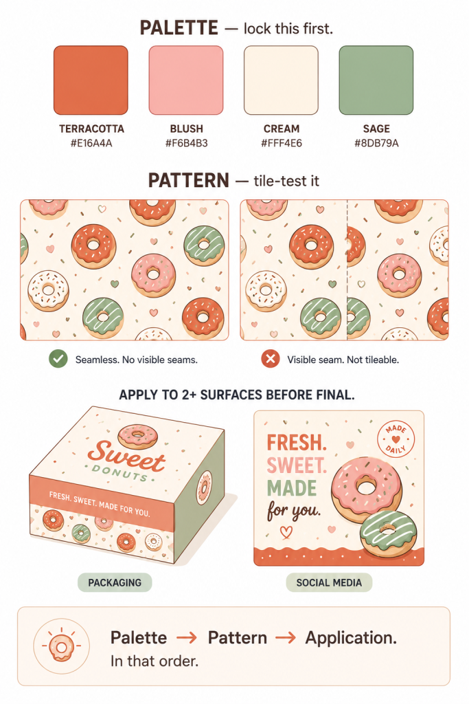
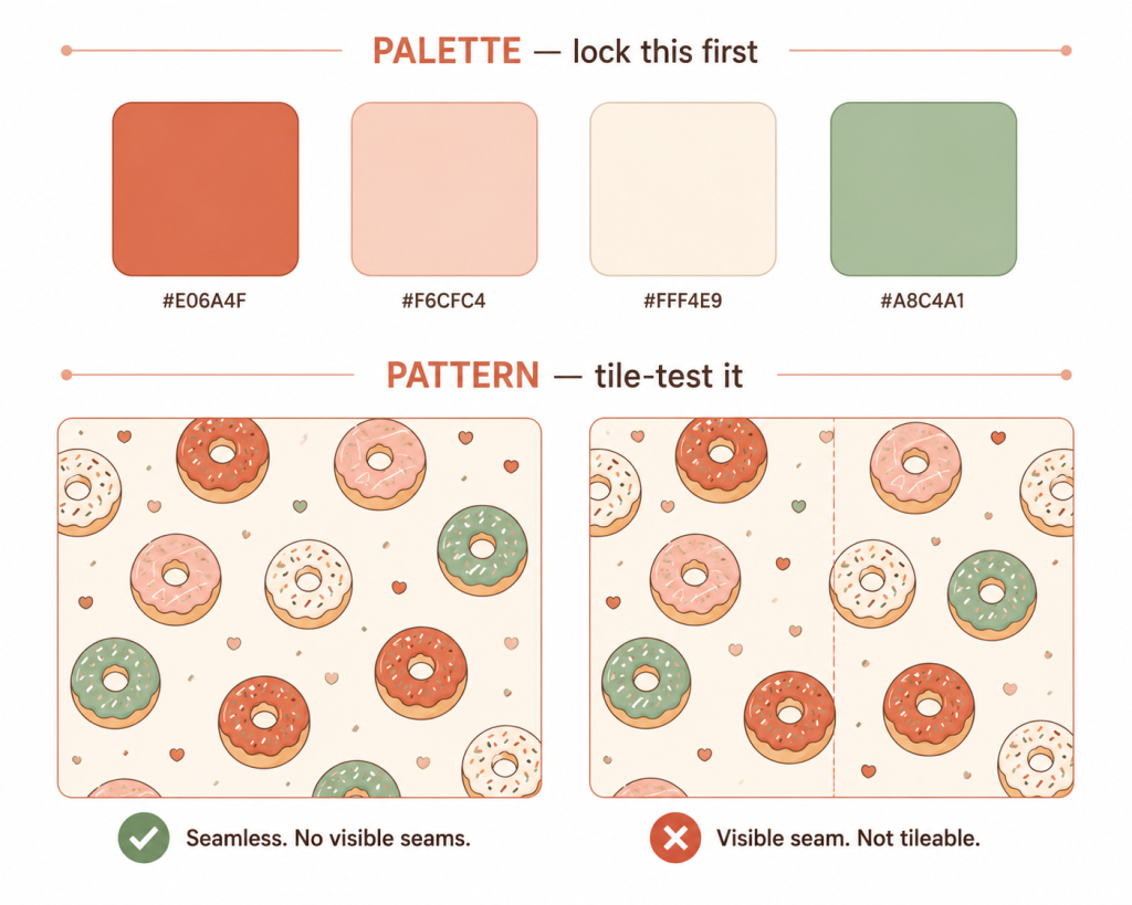
Once the actual problem is visible, the fix is less about hiring better talent and more about sequencing the work differently. Lock the palette and the line style first, before commissioning a single “hero” illustration — the illustration should be an output of the system, not the thing that defines it after the fact. That one decision alone prevents most of the drift that shows up eighteen months later.
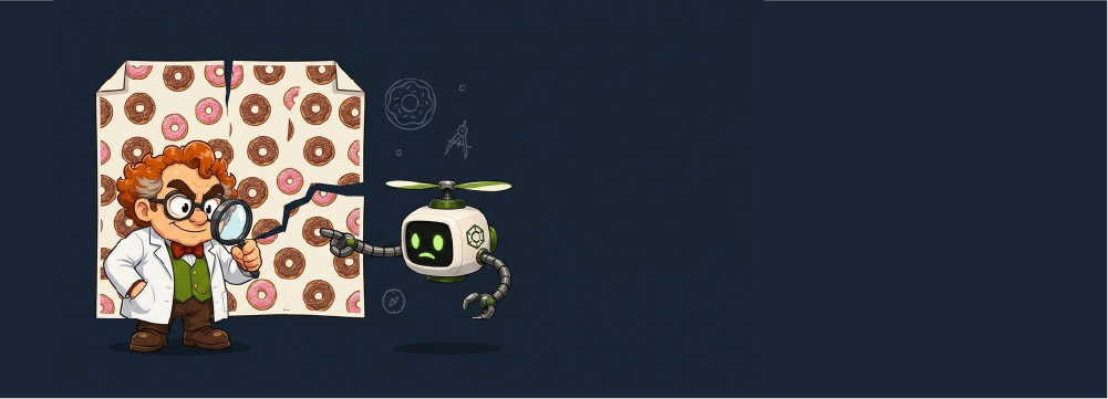
Patterns deserve their own gut check, because they fail in a specific, testable way that illustrations don’t: a pattern either tiles seamlessly or it doesn’t, and there’s no partial credit. Test it the way you’d test a floor tile — laid out edge to edge across a full sheet, does it disappear into a continuous surface, or can you immediately spot where one square ends and the next begins? A pattern that only looks good as a single square in a mockup, and shows visible seams the moment it’s repeated across real packaging, isn’t finished yet.
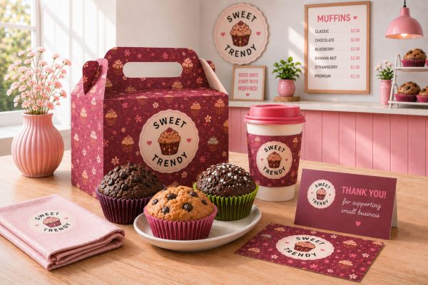
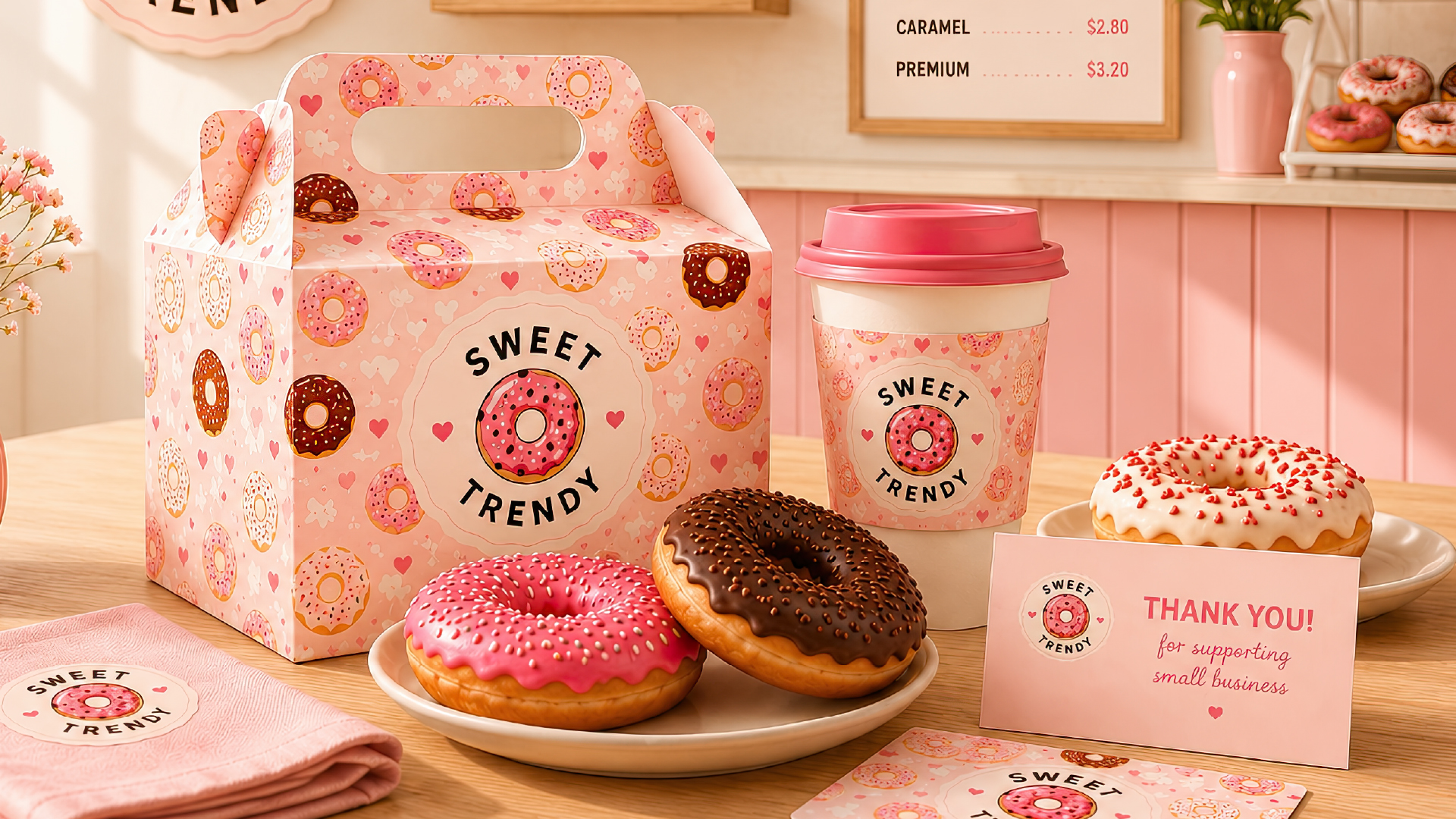
The last check is the one most systems skip: apply everything to at least two real, different surfaces — a packaging box and a social media template, say — before calling any of it final. A palette and a pattern that look great in isolation sometimes fight each other the moment they’re placed on an actual box with actual type on it. That’s a cheap problem to catch in a mockup and an expensive one to catch after print.
The Takeaway
None of this means the illustration doesn’t matter — a genuinely charming donut graphic is still worth having. It just isn’t the thing doing the branding by itself. The brands that stop looking interchangeable are the ones that treat the palette, the line style, and the pattern logic as the actual product, with the illustrations as one visible output of that system rather than the whole deliverable.
If building that system from scratch isn’t where you want to spend the next few weeks, the Donut Branding Kit already ships it solved: 24 donut illustrations and 12 seamless patterns built to one shared palette and line style from the start, plus real packaging and social-application mockups showing how they hold together outside a single hero graphic.