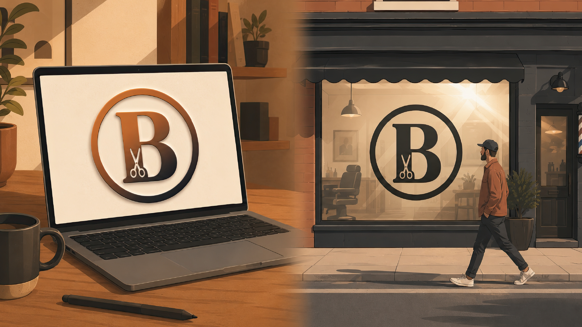
Let me tell you about a barbershop.
Three days before opening, they stick their new storefront logo on the window as a black vinyl decal: the letter “B” with a tiny pair of scissors tucked inside it. Up close it looks great — clean lines, the scissors read perfectly, everything exactly like it was in the file.
Now cross the street, which is where most people are actually going to see it from. That’s where the trouble starts. The letter turns into a gray smear. And the scissors? What scissors? It’s a smudge. The logo was good on a screen, and from across the street it turned to mush.
That’s the whole story, and it happens constantly. The owner looks at the logo on a laptop, and on a laptop everything’s fine — colors are bright, everything’s sharp, and you’re sitting two feet away from it. Then the file goes off to production, and that’s a completely different world, because a picture on a screen is one thing and the same logo cut from vinyl and stuck to glass is another.
Why a Storefront Logo Looks Great on Screen and Fails on the Street
People who do outdoor signs for a living have a simple rule: one inch of letter height for every ten feet of viewing distance. So if you want your logo read comfortably from thirty feet away, the letters need to be about three inches tall. Any less and it doesn’t work.
The rule isn’t about taste, it’s about eyesight. The eye stops picking out small detail at distance, and no amount of good typography changes that.
The barbershop went exactly that way. The letter in their logo was thin, with delicate serifs — the kind of thing that looks expensive on a screen. Outside, a thin line disappears. It just dissolves. Your eye loses it. Especially with sun hitting the glass, because the glare eats anything narrower than a couple of millimeters.
Which is why outdoor work usually sticks to simple, heavy letterforms, with real contrast between the letter and its background: dark on light, or light on dark. It’s not that designers can’t do subtle. It’s that out on a street a logo gets seen badly first — from a distance, out of the corner of an eye, for about two seconds — and only after that, if you’re lucky, does anyone walk over and actually look at it.
So when you’re designing a logo that’s headed for outdoor use, you have to think about how it’ll be made and what size it’s going to hang at. Smooth and pretty on a monitor doesn’t tell you much about how it holds up on a street.

Vinyl Doesn’t Do Gradients
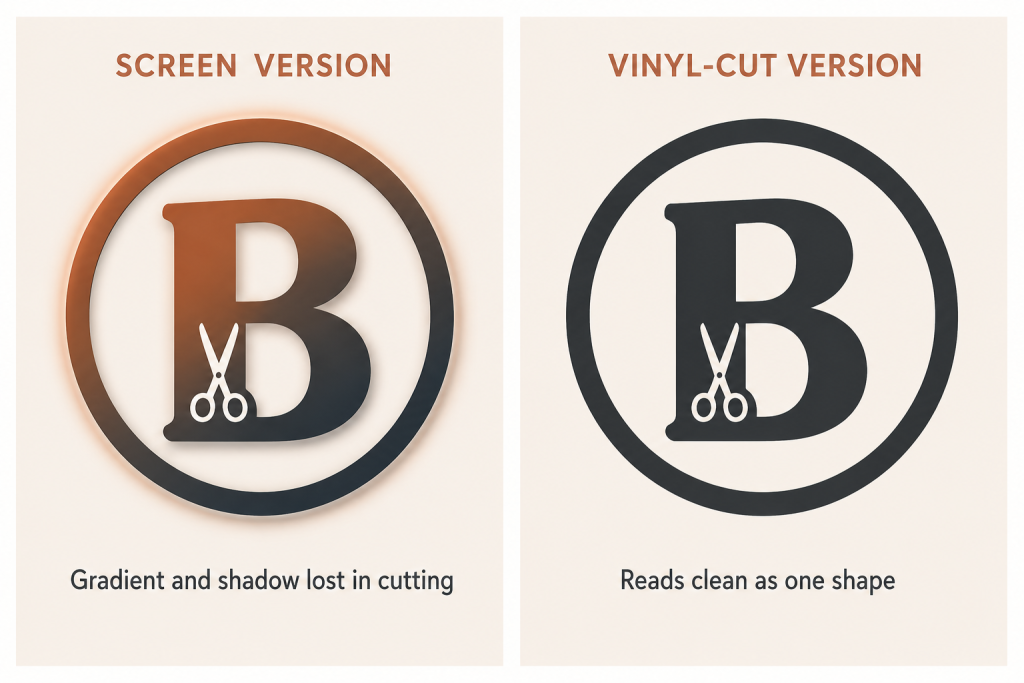
A vinyl decal isn’t printed, it’s cut. The plotter takes a sheet of film in one color and cuts along the outline. No gradients, no shadows, no soft glow around the edges. One color, one shape.
So if a logo leans on a gradient — say the icon only separates from the lettering because it’s slightly lighter — that separation won’t exist on vinyl. What’s left is one solid shape you can’t read.
Checking this is easy. Squint at your logo, or convert it to black and white. If the shape reads clearly, great. If it turns into a formless blob, the vinyl will come out just as bad.
Squinting and going grayscale is worth doing every single time, right up until the final palette is locked. Later on, redoing it costs a lot more.
The Window Isn’t the Only Place
There’s only one decal on the window. Deal with it and you’re done.
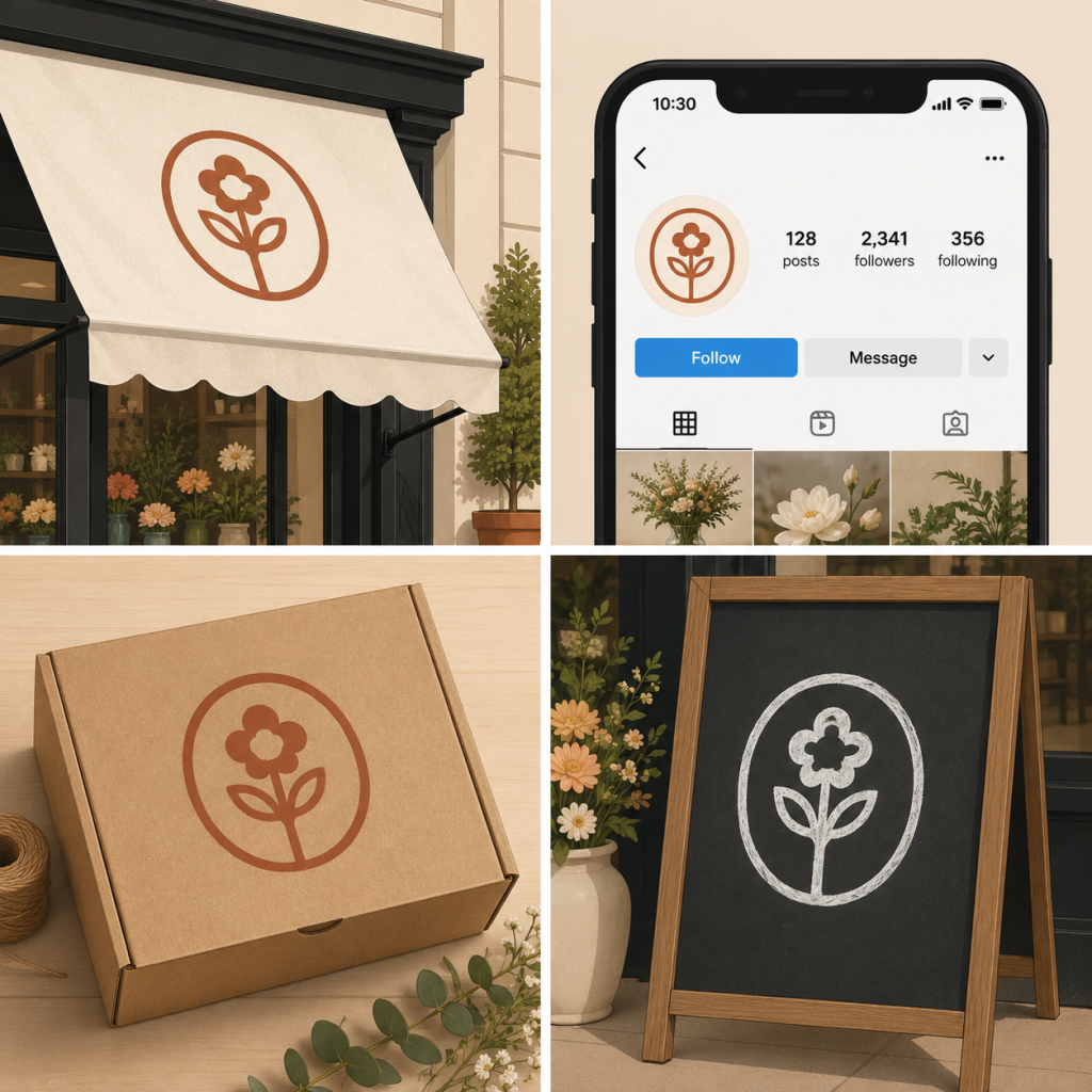
Now picture a flower shop. The same logo sits in several different places:
- as a small round icon on Instagram
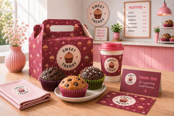
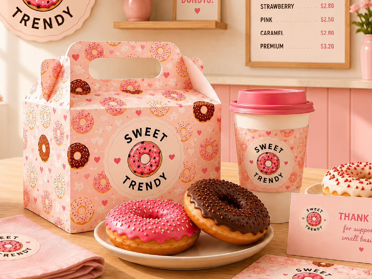
- on the lid of a delivery box
- and sometimes just drawn in chalk on the board by the door
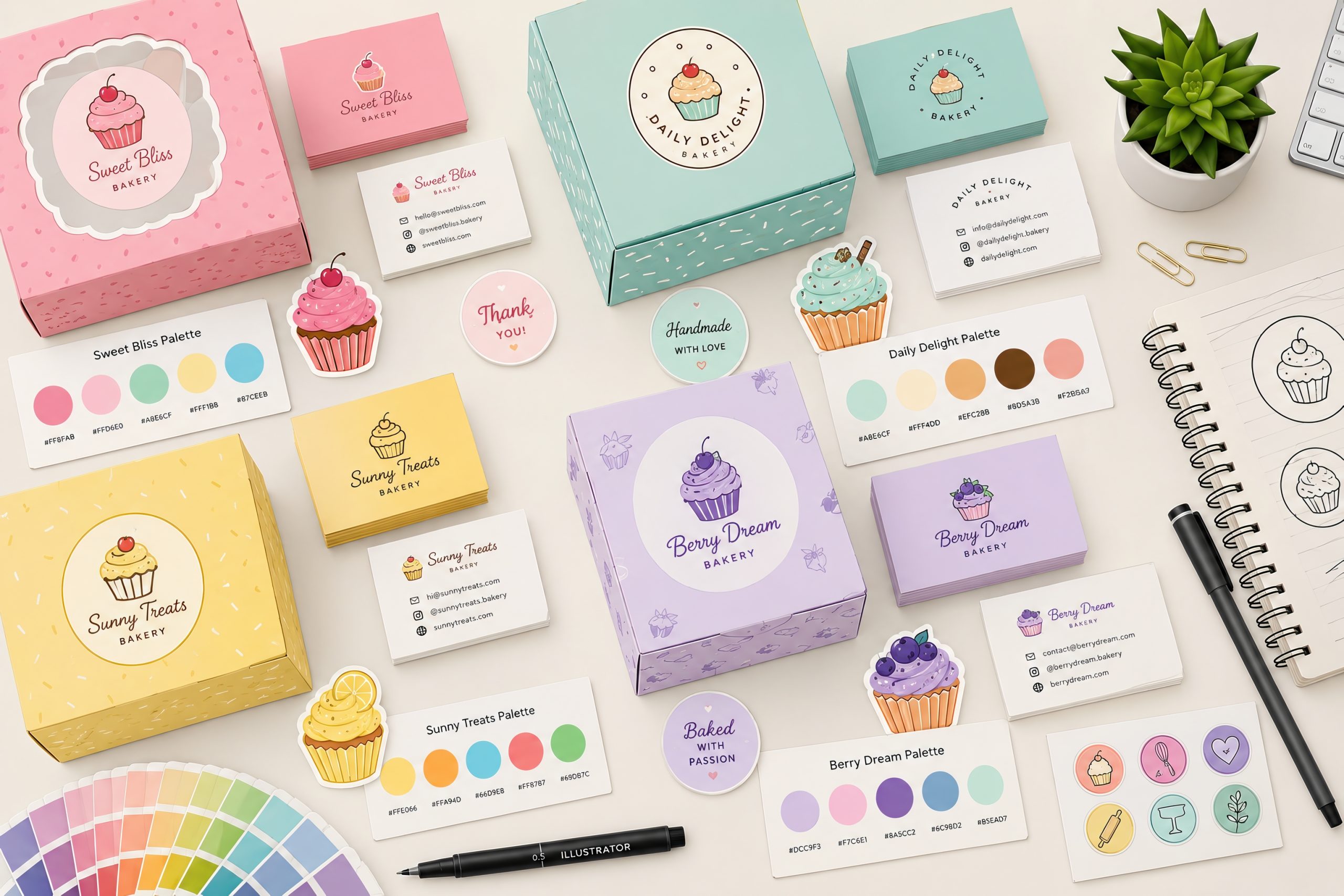
The size is different every time: small in one place, medium in another, large in the third. So is the material — film, cardboard, chalk. So the logo gets adapted for each one separately. For the icon, it’s simplified and the fine detail comes off. For the box, it comes down to a single color. For the chalkboard, only what somebody can realistically draw by hand stays in.
The goal behind all of it is simple: the logo has to work on any material and read clearly from any distance.
This isn’t the same thing as fitting a logo to YouTube, Instagram and a podcast cover. There it’s all screens, and only the shape of the frame changes. Here it’s vinyl, ink, chalk, and a different size every time.
The easiest way through is to make one plain base version first, and build all the others from it.
The Order This Gets Done In
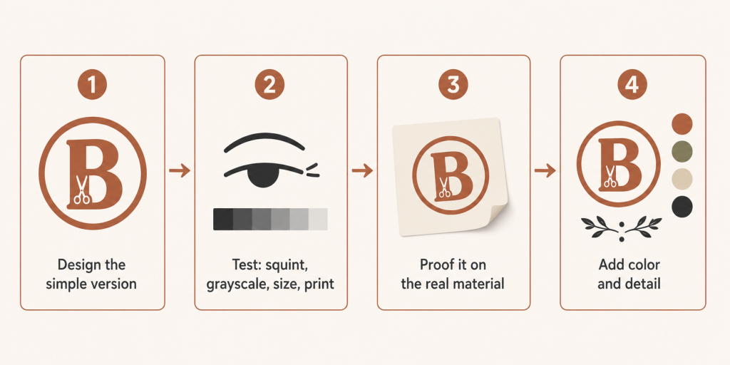
Put together, the sequence is pretty simple, and most small business signage gets designed in exactly the wrong order.
Start with the plainest version of the logo: one color, no gradient, no fine detail. Then test it — squint at it, convert it to black and white, shrink it to icon size, print it at full size and walk thirty feet away from it. After that, if you can, get a proof made on the real material, because sign shops charge very little for that compared to redoing a whole order. And only once the simple version has survived all of it do you start adding color, detail, and everything else.
The order matters, and the reason is money. While the logo lives in a file, every change is free. Once it’s cut from vinyl and stuck to glass, every change costs.
How It Ended
The barbershop’s decal did get redone eventually. They didn’t touch the logo itself — just took a heavier weight of the same letterform and made it slightly bigger. Same mark, same shop, same “B.”
The only thing that changed: somebody finally walked outside and looked at the window from there.
Which is the whole point. A good logo isn’t the one that looks nice on a screen. It’s the one that works on any material it lands on:
- a sign
- a shop window
- vinyl
- a delivery box