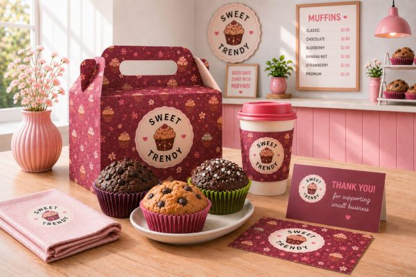
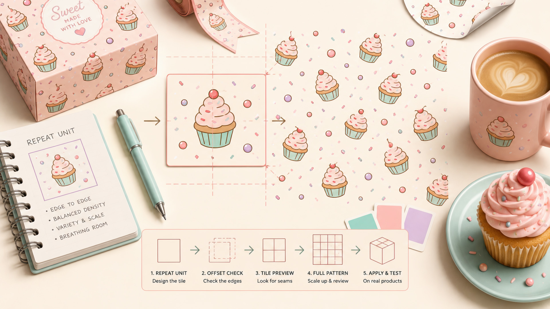
Two designers can start with the exact same cupcake illustration — same colors, same linework, same charm — and end up with completely different results the moment they try to turn it into a seamless pattern for packaging. One version tiles cleanly across a box, a ribbon, a sheet of stickers, disappearing into one continuous, professional-looking surface. The other shows a seam the instant it repeats: a gap where two cupcakes almost-but-not-quite touch, a stripe of empty space marching diagonally across the design, or the same cupcake lining up directly under itself until the whole thing reads as “clip art, repeated” instead of “pattern.”
The difference has nothing to do with how well either designer can draw a cupcake. It lives entirely in the invisible math behind the illustration — the repeat unit, the small tile that quietly does the actual work of turning one drawing into something that can wrap an entire product line without ever showing its seams.
A seamless pattern is really a small, carefully engineered square that’s been built to disappear when it’s placed next to a copy of itself. Understanding that one mechanic is what separates a pattern that reads as designed from one that reads as stickers scattered onto a grid.

What a Seamless Pattern’s Repeat Unit Actually Is
A pattern isn’t an endless hand-drawn illustration — nobody draws a thousand cupcakes to cover a box. It’s one small square, usually called the repeat unit or tile, that gets copied and placed edge to edge, over and over, until it fills whatever surface needs covering. Everything that makes a pattern feel professional or feel like an accident lives inside the design of that single tile.
This is why a great pattern designer spends most of their time on a shape smaller than a coaster. Get that one tile right — where every motif sits, how it behaves at the edges, how much space surrounds it — and the software (or the print run) does the actual work of multiplying it into something the size of a shop window. Get it wrong, and no amount of careful printing fixes a tile that was never built to repeat.
Why Edges Are Where Patterns Succeed or Fail
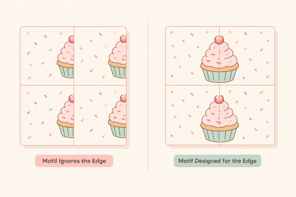
Because the tile repeats, whatever touches its left edge has to continue seamlessly into whatever sits on the right edge of the next copy — and the same is true top to bottom. Draw a motif without checking what happens at its own boundary, and it either gets sliced off awkwardly where the tile ends, or it creates a hard visual line the moment two tiles sit side by side. The eye is unusually good at catching exactly this kind of break, even when it can’t say why something looks slightly wrong.
The standard way to catch this before it becomes a printed problem is to offset the tile — slide it by half its width and half its height in your design software — so the edges that would normally sit invisibly against the canvas border now land in the middle of the visible artwork, where any mismatch is impossible to miss. A cupcake cut cleanly in half by the tile boundary shows up immediately once that seam is dragged into view. Fixing it at that stage costs a few minutes; finding it after a packaging run has already printed costs considerably more.
Balancing Density So the Eye Doesn’t Find a Repeat
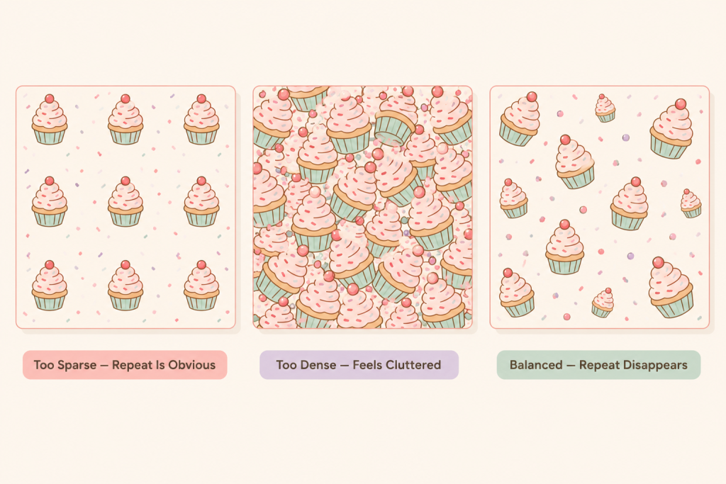
A seamless tile can be technically flawless at the edges and still fail for a second, less obvious reason: if the tile has too few motifs, or every motif is identical in size and rotation, the human eye locks onto the repeat distance almost instantly. It’s the same reason cheap wallpaper reads as “wallpaper” the moment you notice the same flower reappearing at the same interval — the pattern isn’t wrong, exactly, it’s just too easy to measure.
The fix is rarely to add more detail everywhere — an overcrowded tile just trades one problem for another. It’s to break the rhythm: vary the rotation and scale of the same cupcake slightly between instances, mix in two or three supporting motifs (a sprinkle, a small dot, a swirl) instead of repeating one hero icon on its own, and leave real breathing room between elements so the eye has somewhere to rest. A tile with this kind of quiet variety stops giving the eye a measurable interval to catch, and the pattern starts reading as texture rather than as a grid of stamps.
Testing a Pattern Before You Trust It
A single tile can look convincing in isolation and still fall apart once it’s actually doing its job. Before calling any pattern finished, tile it across a full sheet at its real output size, not just the one square shown in a mockup — problems that are invisible in a 2×2 preview often become obvious across a 6×6 grid, where a faint diagonal stripe or an accidental checkerboard rhythm has more room to show itself.
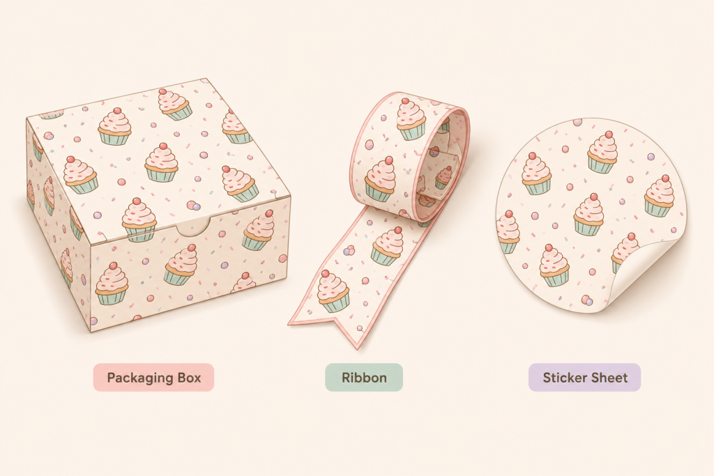
Then test it on the actual surface it’s meant for, not just as a flat digital swatch. A pattern that reads as balanced on a screen can behave differently wrapped around a curved box, printed at a smaller scale on a ribbon, or cropped into a circular sticker — each surface crops and compresses the tile differently, and the only way to know a pattern survives that is to look at it on the real shape, at the real size, before it goes anywhere near a print run.
The Takeaway
Go back to those two designers with identical cupcake illustrations. The one whose pattern quietly does its job everywhere the brand shows up isn’t more talented — they just spent their attention on the part almost nobody looks at directly: the tile, its edges, and how densely it’s populated. Everything a customer actually notices, the calm, continuous surface wrapping a box or a ribbon, is a side effect of getting that invisible part right first.
If you’d rather start from patterns that already got this right, the Cupcake Branding Kit ships 12 seamless patterns built exactly to these rules — tested edges, balanced density, ready to drop straight into packaging, ribbons or social templates. The Free Cupcake Vectors pack is a lower-commitment way to test a few seamless patterns on your own project before deciding whether the full kit is worth it.